


As much as I’d like to support the Philippine Department of Tourism, I cannot condone the choices they’re making. We are a nation with amazing artists. We have top Marvel and DC artists based here. We have an abundance of globally awarded advertising agencies here. We have so many talented designers, a lot of whom would work for free to help the government out. And yet, we continuously come up with things like this:

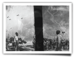
This is the logo that DOT came out with to encourage local tourists to travel. According to Ironwulf En Route, “This is DOT’s new official logo for Pilipinas, Tara Na Campaign. This was made in cooperation with Smart and Perception of domestic tourism only.” Luckily, I’m always surrounded by opinionated artsy folk here and online. So I showed them the logo and here are their responses.
Art Prodigy:
“It looks like it's been done by kid who's in a public school elementary. Pang on-the-spot poster making contest”
Photographer:
"It's f*ck*ng horrible. T*ng*n*, I would rather that they steal something all over again, than put shit like that up on the net. It looks like an 80s cartoon for a gradeschool text book. And that girl on the boat looks like the scene in Titanic."
Web Designer:
“You can’t resize that. It’s not applicable as a logo.”
Creative Director (and Twitter Celebrity):
“It doesn’t motivate me to travel anywhere. It’s cheap and dated.”
Head of Design:
“Panget? Coloring book? Pambata? A logo should have flat colors as much as possible no gradient. Flat colors with dark & light background variations. Kumbaga reverse puwede mo i-apply sa dalawa.”
I kept their names hidden because I wanted their answers to be as candid as possible. My opinion on it, which I posted on Twitter: “The new DOT logo reminds me of some cartoons I saw in a Saudia Airlines giveaway. I got that more than a decade ago”. In hindsight, that was better done. It also had kids on a plane. But they didn’t look like they were attached to it.


Based on the Illustrations I sort of imagine the caption to be...
OFWs, now coming to you.
ermmm... well maybe more like...
OFWs, parating na sa inyo.