What I'd tell you? In my last post, I said there's a wealth of artistic talent in the Philippines. So much so that some top designers are willing to help out the government for free. In practically no time at all, Team Manila came up with their own versions of the "PILIPINAS, TARA NA!" logo and I am liking it.
I think they've managed to capture the fun intent of the original logo. They used a whole lot of colors, quite unusual for modern logos but essential in the Philippine market. My personal favorite is the last one. Which one's yours?
Check Team Manila's Flickr for more designs.
Note: I tried posting this yesterday but for some reason Blogger wasn't uploading pics. Gar.





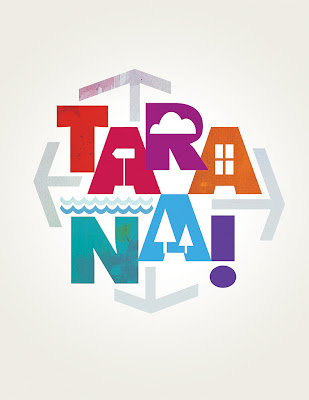


I like the green effect on the designs presented. Most likely,it represents the cool breeze in the Philippines. Generally, the designs were ok! Keep it up Team Manila!